The Booking Form Settings allow you to customize the look and feel of the booking process once you have enabled bookings for your website.
To get direct bookings for your Webready website, you must first subscribe to the Booking Engine app from the App Store.
The Booking Form Settings can be found on the Booking page in the Website Editor.
Below, we'll explain the different options available in the Layout tab of the Booking Form settings.
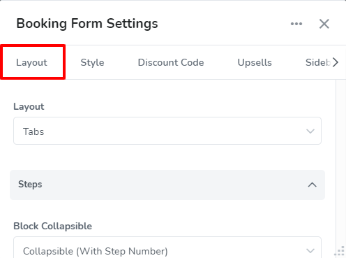
The Layout Tab allows you to control the overall setup and details seen on the booking form. This includes specifying how the booking form steps should be displayed and where it should be located.
Customization can be done through the different sections as follows:
Layout
The Layout option lets you choose if booking steps will be displayed in separate tabs or placed directly below each other.
There are 2 options for the layout: Simple and Tab.
Simple:
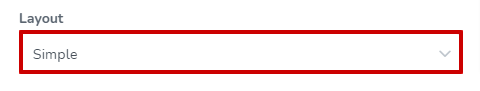
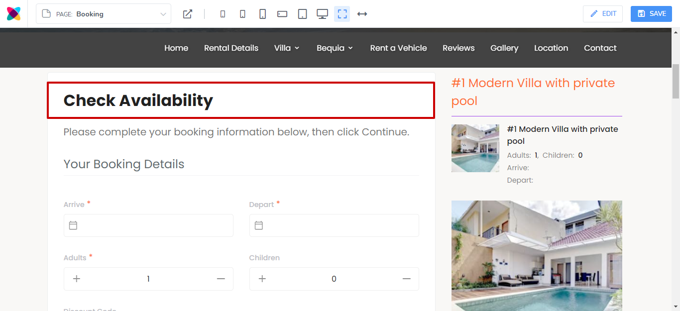
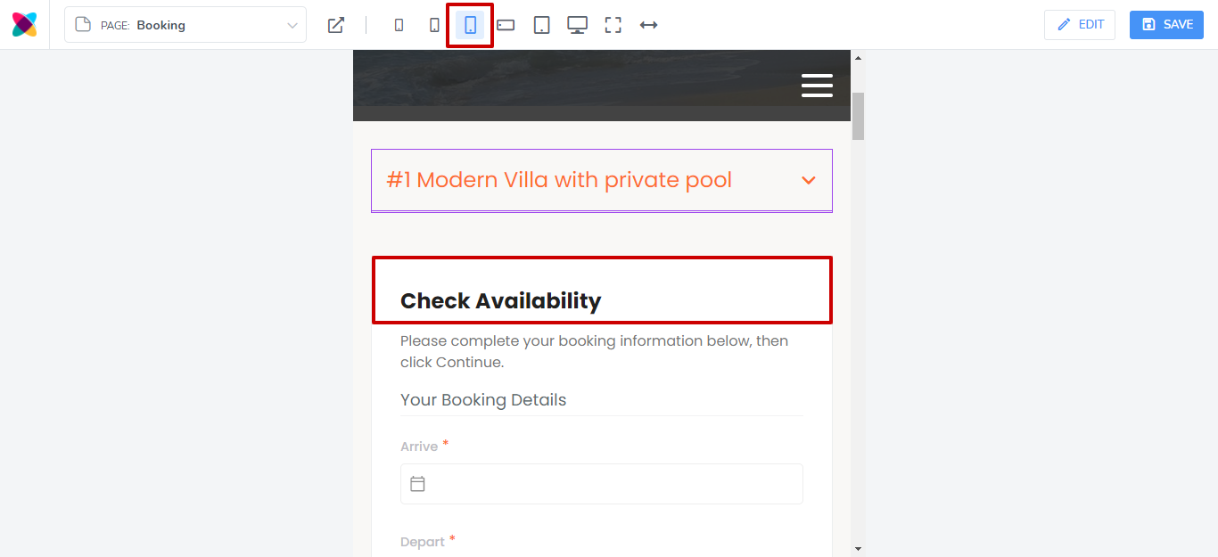
The Simple option will show the booking form steps one after the other, continuously down the page, in blocks.
Tab:
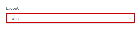
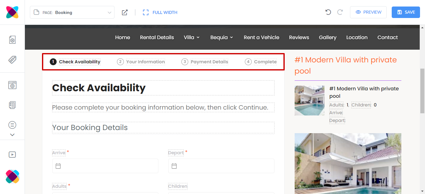
The Tab option displays each booking step in a separate tab - as the guest completes one step, they will have to click a button to continue to the next step.
Steps
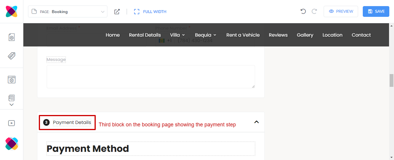
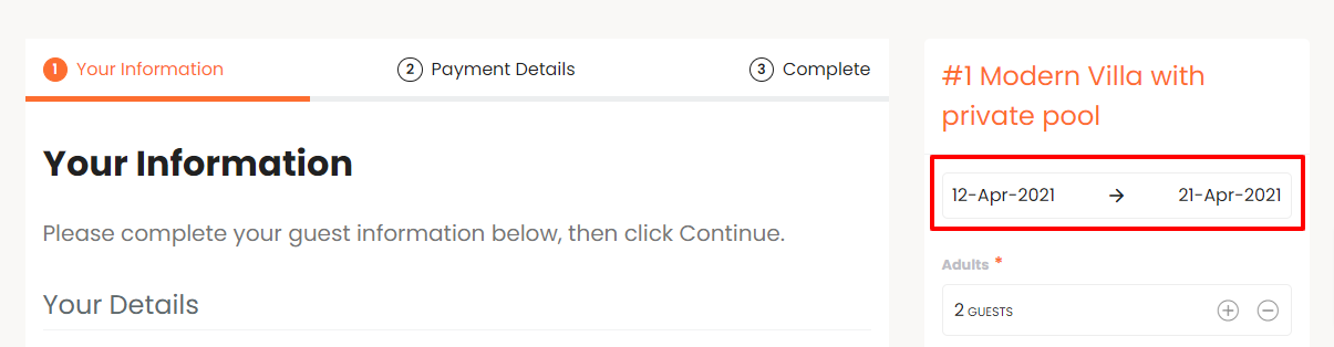
This section lets you specify how the blocks or tabs should be displayed. You'll also be able to choose whether to include a "Complete" step as part of the booking process, which will allow guests to review their information before submitting the booking.
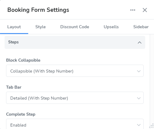
The options available to be customized for Steps are as follows:
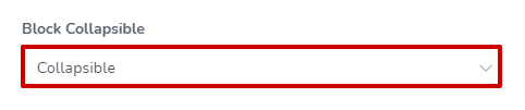
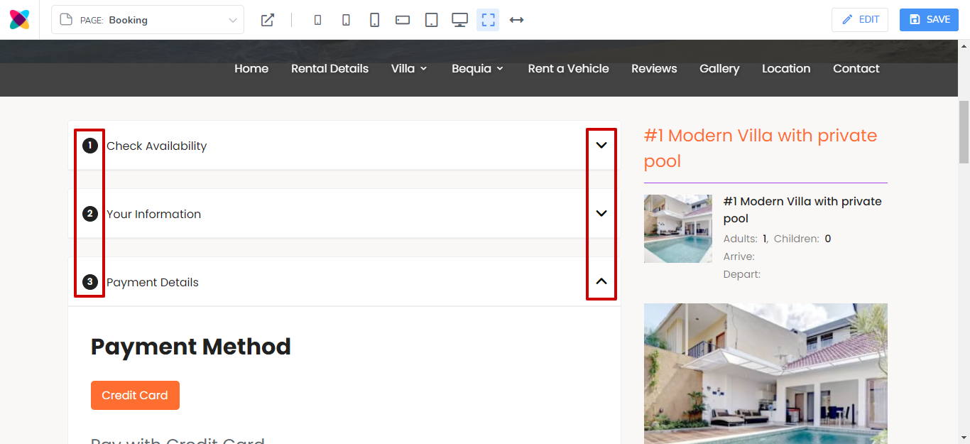
Block Collapsible
There are 3 options for this: None, Collapsible and Collapsible (With Step Number).
None:
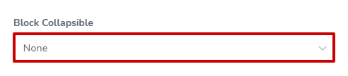
When None is selected, there will be no arrow to collapse or expand the different booking steps. In the case of blocks (simple layout), the guest will need to scroll down to see the next step.
For the Tab layout, this option will only be obvious for smaller screen sizes where the tabs are displayed in blocks.
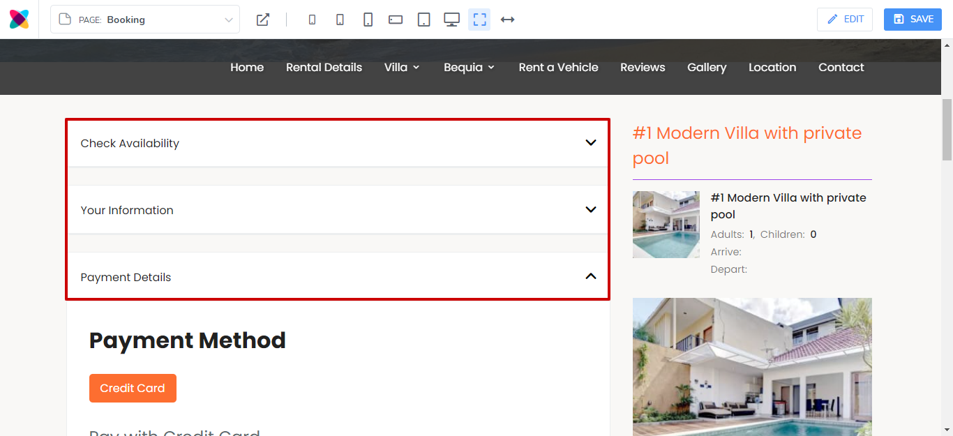
Collapsible:
With the Collapsible option, blocks will have arrows allowing you to collapse and expand the steps instead of having to scroll to get to other steps.
Collapsible (With Step Number):
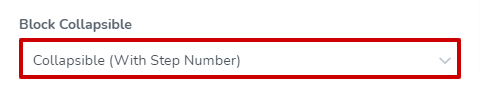
Collapsible With Step Number, displays arrows at the right of the step, allowing you to collapse and expand, instead of having to scroll to get to other steps, while also placing the step numbers next to the step titles.
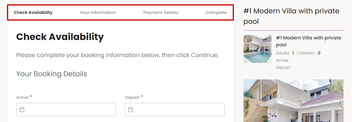
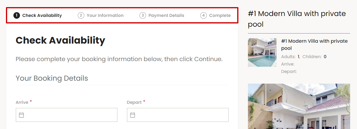
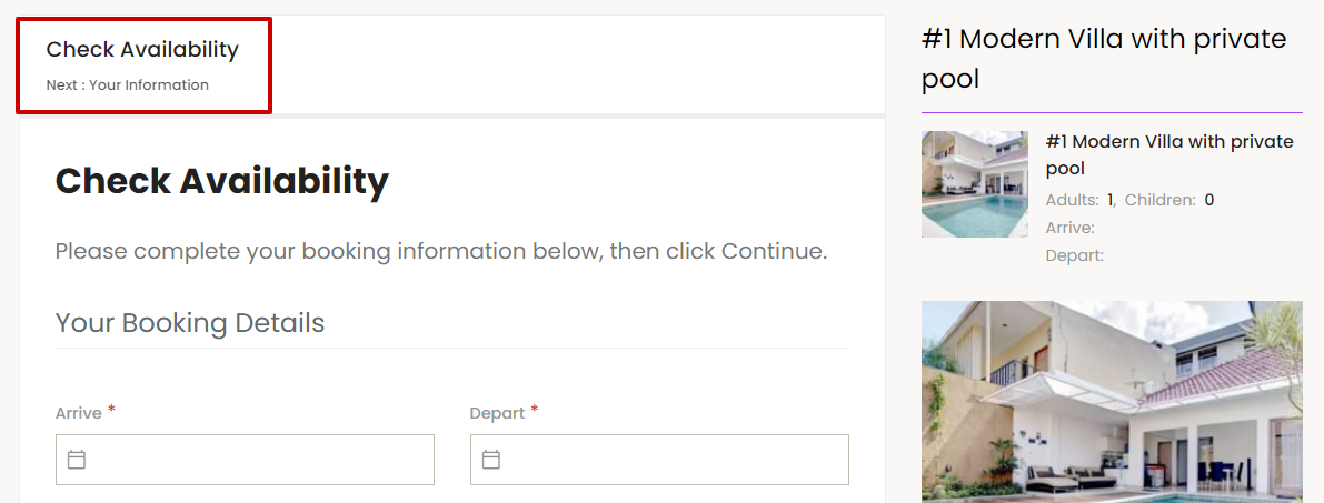
Tab Bar
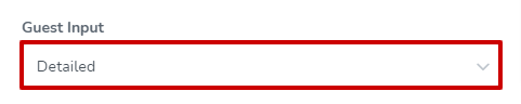
There are 3 options for this: Detailed, Detailed (With Step Number) and Simple.
Detailed:
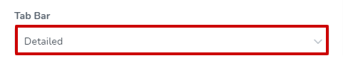
The Detailed option will display the title of the tab.
Detailed (With Step Number):
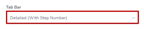
The Detailed (With Step Number) option will display the step number, along with the title of the tab.
Simple:
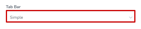
The Simple option shows the current step, with an indication of the next step below the tab title. Once the details have been completed on the current step, you will be able to navigate to the next step. This is ideal for small screen sizes.
Simple (With Progress Indicator):
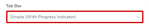
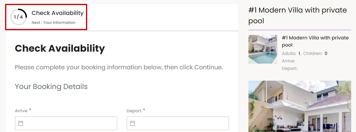
The Simple (With Progress Indicator) tab option displays a progress indicator along with the title of your current and next step.
Complete Step
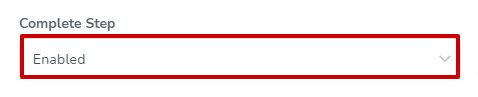
The Complete Step can either be enabled or disabled. Enabling it will show an additional step as the final step in the booking process. This step will allow guests to review their information before submitting the booking.
When enabled, the booking step will be seen like this:

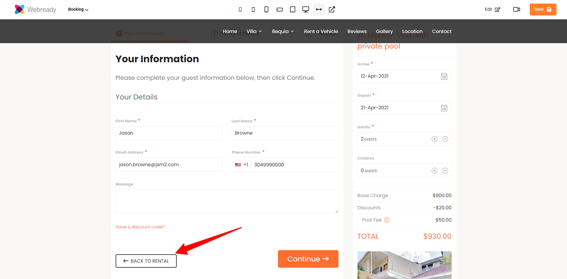
Back To Rental Button
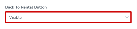
The Back To Rental Button can either be set to be visible or hidden. When "Visible" is selected, this button will be shown on the first step, allowing guests to click it to go back to the rental details page.
When visible, the Back To Rental Button will be seen like this:
Booking Form Info
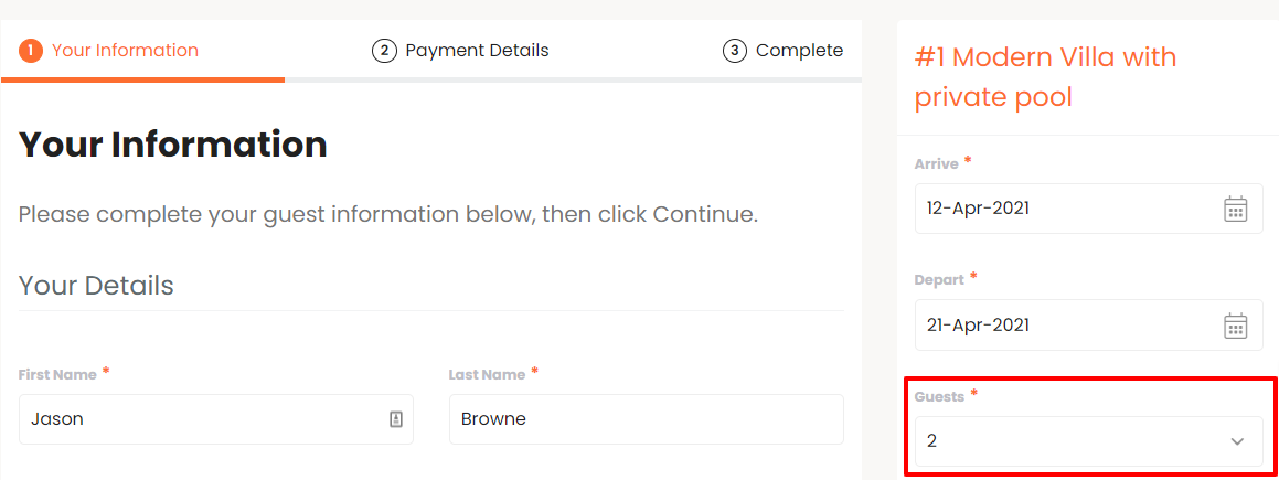
This section lets you specify where the booking form should be placed and allows you to adjust how the booking dates and guest count input fields are displayed.
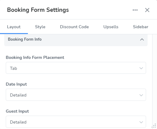
Within the Booking Form Info section, you will be able to customize the following:
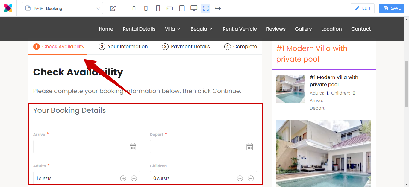
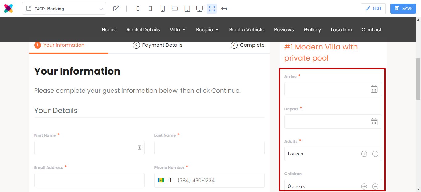
Booking Info Form Placement
The Booking Form Info can either be placed in the Tab or Sidebar.
Tab:
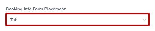
When the tab option is selected, the Booking Info Form will be displayed as the first step in the booking tab or block.
Simple layout (Booking Info Form is in the first step in the block):
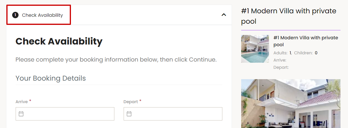
Tab layout (Booking Info Form is in the first step in the tab):
Sidebar:
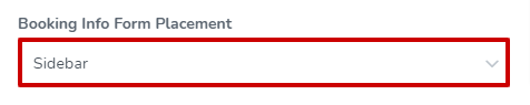
When Sidebar is selected, the Booking Info Form will show in the sidebar area instead.
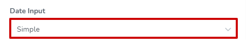
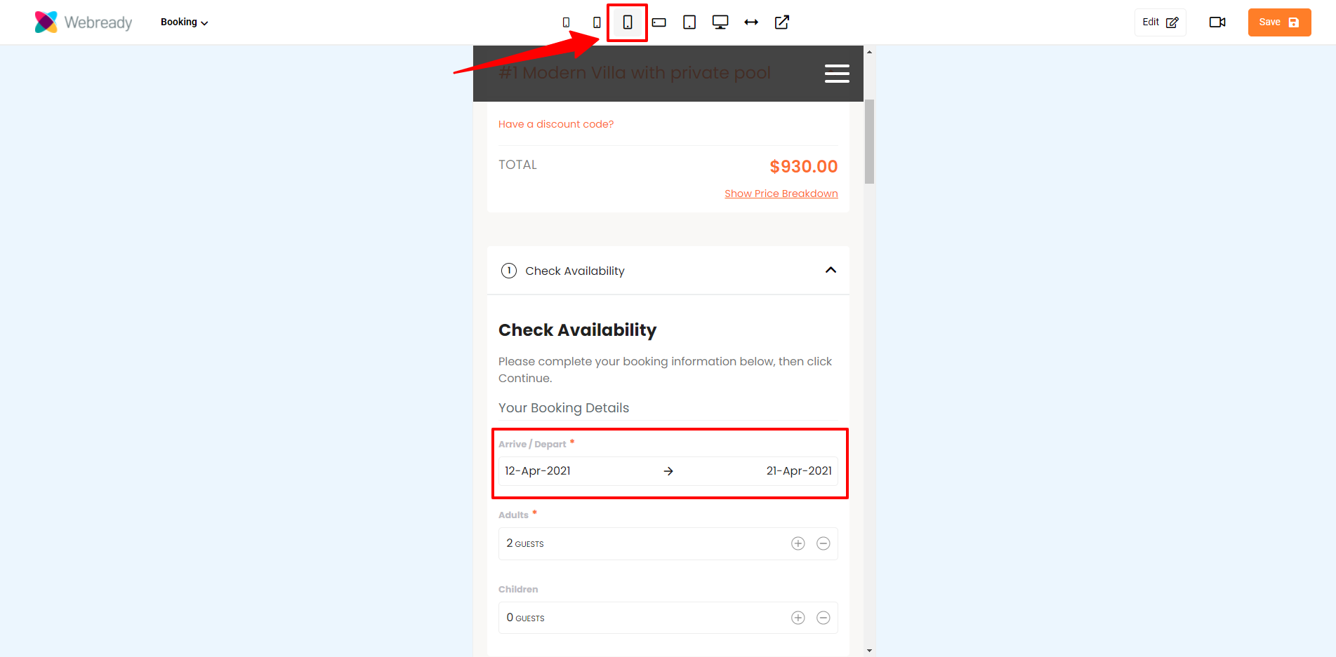
Date Input
The available Date Input options are Simple, Simple (With Label) or Detailed.
Simple
The Simple date input option allows the Check-In and Check-Out fields to be shown on 1 line. This is always the case when the Booking Info Form is in the sidebar. However, when the Booking Info Form is in a tab, the date inputs will only show on 1 line on smaller devices.
Sidebar showing date inputs on 1 line:
Tab with the Simple date input selected on a large screen:

Tab with the Simple date input selected on a small screen:
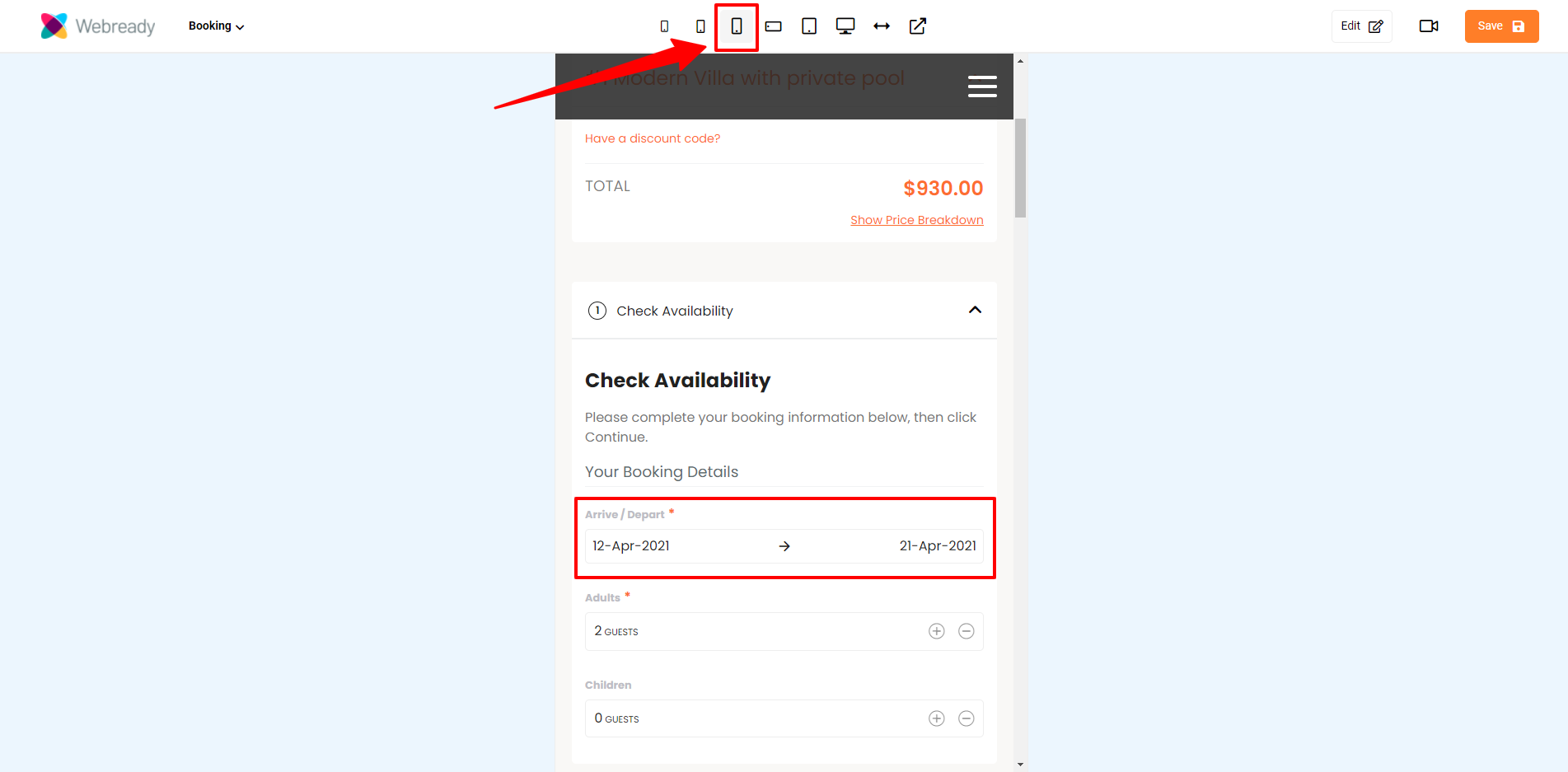
Simple (With Label)
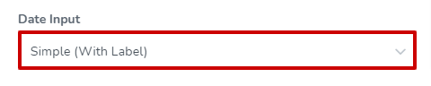
The Simple With Label date input option allows the Check-In and Check-Out fields to be shown on 1 line with a label. This is always the case when the Booking Info Form is in the sidebar. However, when the Booking Info Form is in a tab, the date inputs will only show on 1 line on smaller devices - in larger screens, the detailed view will be seen.
Sidebar showing date inputs on 1 line with labels:

Tab with the Simple (With Label) date input selected on a large screen (the detailed view is seen):

Tab with the Simple (With Label) date input selected on a small screen:
Detailed
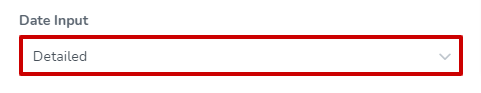
The Detailed option shows the Check-in and Check-out dates separately and with labels. This is always the case regardless of whether the date inputs are in the sidebar or on a tab, and for any screen size.

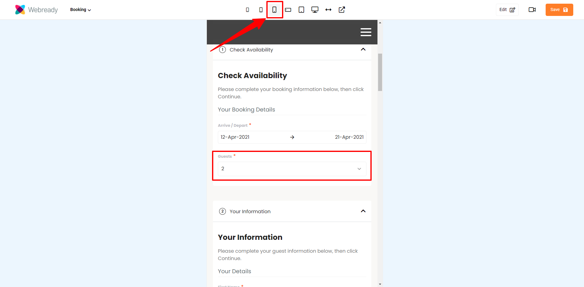
Guest Input
The available Guest Input options are Simple and Detailed.
Simple
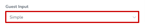
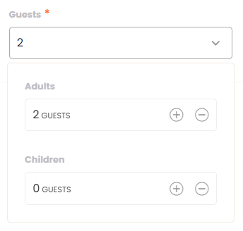
When the Simple guest input is selected, the Guests option will display on 1 line that will expand when clicked to allow to input values for adults and children. This is always the case when the Booking Info Form is in the sidebar. However, when the Booking Info Form is in a tab, the guest inputs will only show on 1 line on smaller devices - in larger screens, the detailed view will be seen.
Sidebar showing guest input on 1 line with labels:
Expanded view when clicked:
Tab with the Simple guest input selected on a large screen (the detailed view is seen):

Tab with the Simple guest input selected on a small screen:
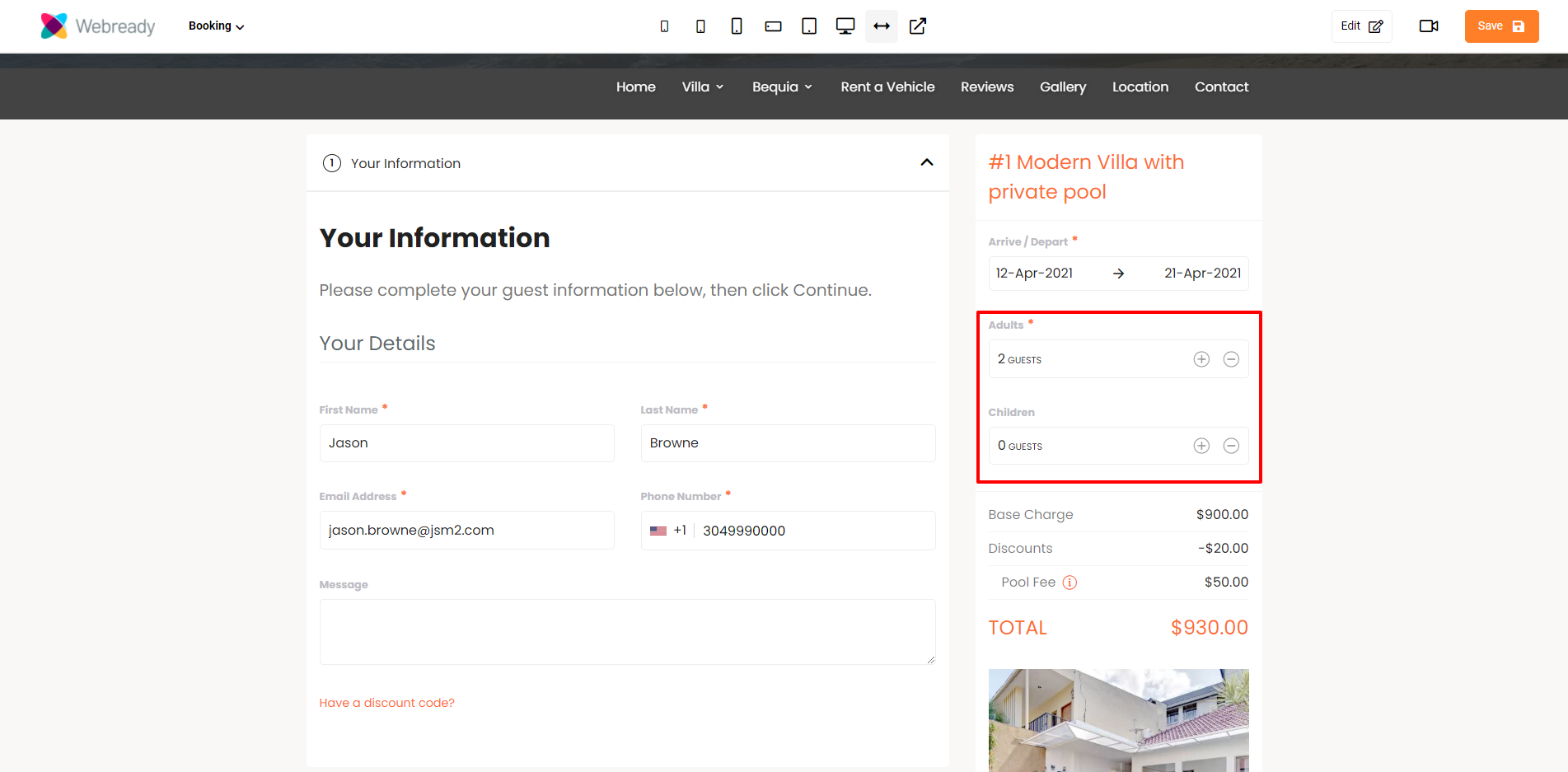
Detailed
The Detailed option shows the Adult and Children input fields separately and with labels. This is always the case regardless of whether the guest inputs are in the sidebar or on a tab, and for any screen size.
Phone Number
Choose if you will require guests to enter a country code with their phone number or if and how a default value should be added. Here, you can also specify if you will like phone numbers to be validated.
Under this section, you'll be able to perform the following changes:
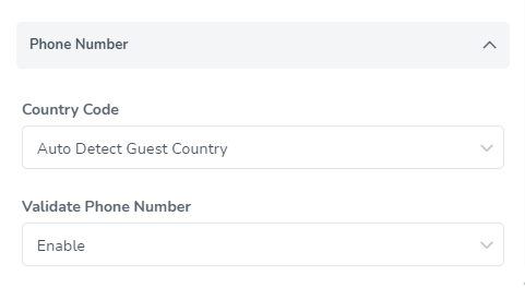
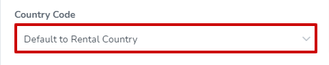
Country Code
The Country Code options are as listed below:
Disable
No Default Country
Default to Rental Country
Default to Website Country
Auto Detect Guest Country - Using Guest IP Info Lookup
Disable
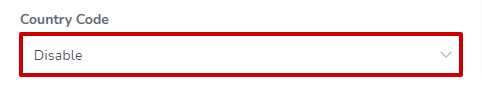
The Disable option allows guests to enter a telephone number without a country code.
No Default Country
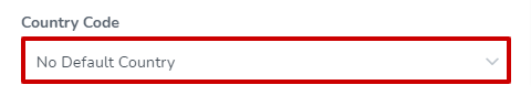
With the No Default Country option, when the guest clicks into the phone number field, a pop up with a search bar will be available allowing the guest to find and select their country code.
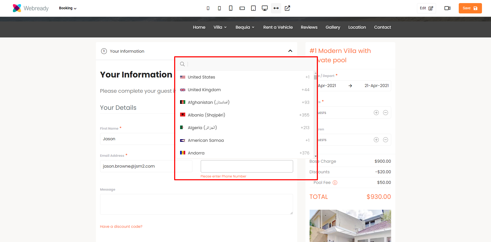
Phone number field showing the selected country:
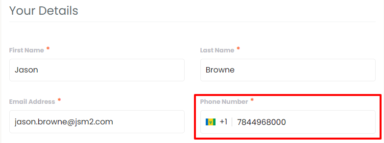
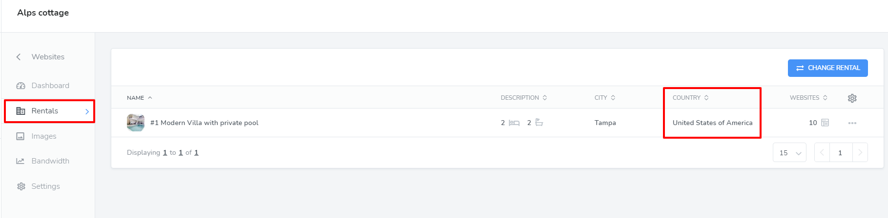
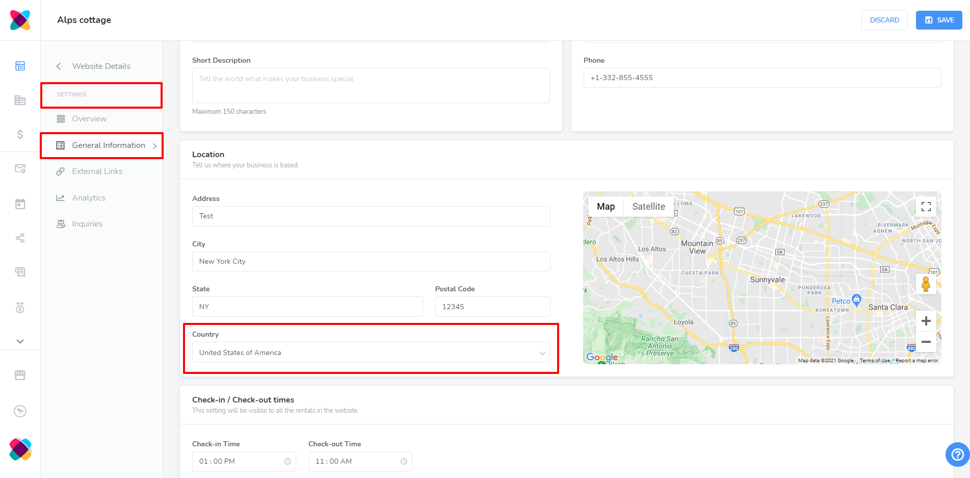
Default to Rental Country
With the Default to Rental Country option, the country code from the rental will automatically be filled into the telephone field.
Rental country:
Country code automatically entered for the telephone field based on the rental country:
Default to Website Country
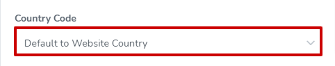
With the Default to Website Country option, the country code that is saved for the website will automatically be filled into the telephone field.
Website country:
Country code automatically entered for the telephone field based on the website country:
Auto Detect Guest Country - Using Guest IP Info Lookup
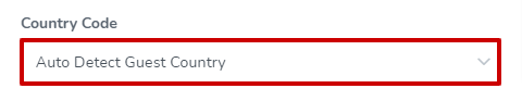
The Auto Detect Guest Country - Using Guest IP Info Lookup option will automatically fill in the country code based on the guest's IP information.
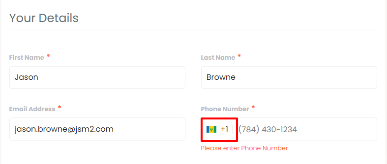
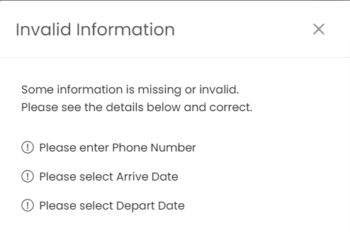
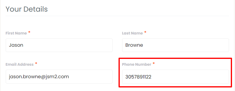
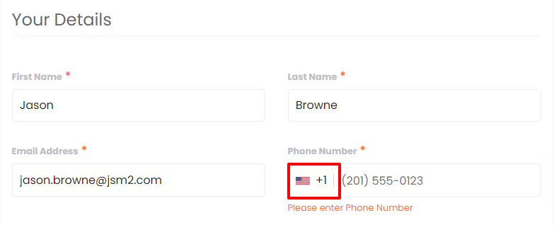
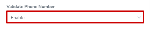
Validate Phone Number
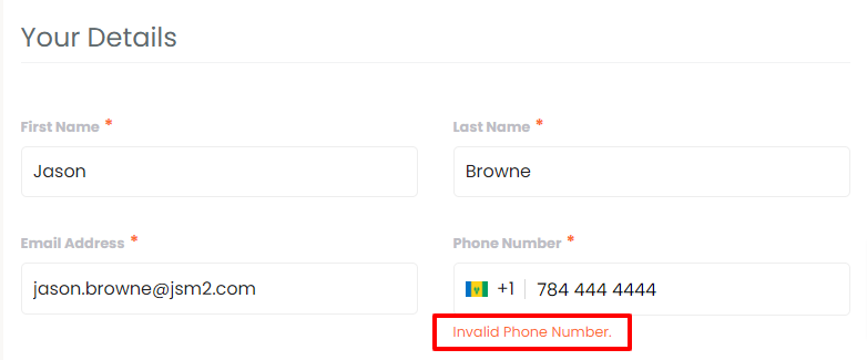
The Validate Phone Number can either be enabled or disabled. Enabling it will allow the phone number entered to be validated. If there is an issue with the value entered, the guest will be prompted to correct it.
When enabled and there's an issue, the error will be seen like this:
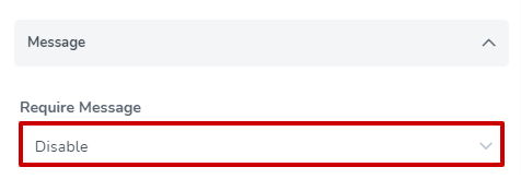
Message
The Require Message option can either be enabled or disabled. Enabling it will require that a message be sent with the booking details.
Validation Messages
Validation Messages can either be Disabled or Enabled. Enabling it will allow you to display all validation messages in a pop-up window.