Advanced Search Settings - Layout Tab
 Updated
The Advanced Search Settings can be found on the Rentals page in the Website Editor.
Below, we'll explain the different options available in the Layout tab of the Advanced Search settings.
The Layout Tab allows you to set how information will be displayed for your rental card, map, grid view and lets you adjust how your availability calendar should be shown.
Customization can be done as follows:
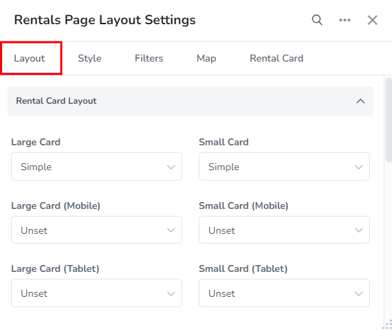
Rental Card Layout
The Rental Card Layout option lets you choose the layout format to be shown for different size rental cards and on different devices.
There are 2 options for the rental card layout: Simple and Detailed.

Simple:
The Simple option will show the rental card with rental details in a condensed format.

Detailed:
The Detailed option will show the rental card with a large image slider and rental details in an expanded format.

Large Card - The large card is displayed in the List view and if there's enough space in the Editor. The Simple and Detailed format is available for large cards.

Small Card - The small card is displayed in the Grid view and on small devices. Small cards only have the Simple format option.

Large Card (Mobile) - There are 3 options for this: Unset (Use default rental card format), Detailed and Simple.

Small Card (Mobile) - There are 2 options for this: Unset (Use default rental card format) and Simple.

Large Card (Tablet) - There are 3 options for this: Unset (Use default rental card format), Detailed and Simple.

Small Card (Tablet) - There are 2 options for this: Unset (Use default rental card format) and Simple.
Map
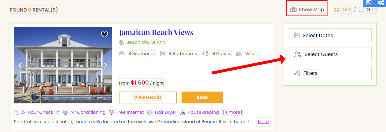
The Map section lets you choose which devices you will like to enable the map on, if the map should be shown by default and it lets you specify the placement of the map and toolbar.
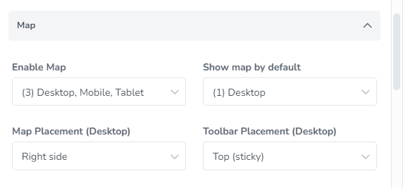
Enable Map: Here you will have checkboxes available to select which device size you will like the map to be enabled for. The options are Desktop, Mobile and Tablet.

Enable Map selection for only Mobile and Tablet as seen on the Rentals page.

Show map by default: Checkboxes will be available allowing you to select which device size you will like the map to show by default. The options are Desktop, Mobile and Tablet.

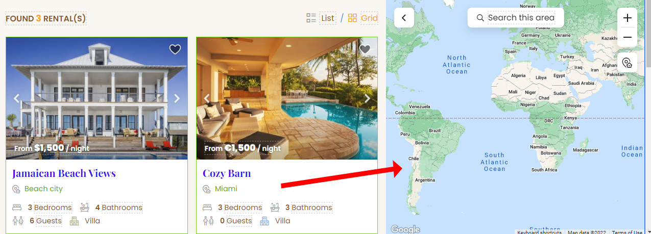
Map Placement (Desktop): This option allows you to choose whether you will like the map to display on the Right side or Left side of the page on a desktop device.

Right side map placement as applied to the Rentals page.
Toolbar Placement (Desktop): This setting allows you to specify where you will like the toolbar to be displayed. The available options are: Top (sticky), Right side (when map is hidden) and Left side (when map is hidden).

Top (sticky) toolbar placement as applied to the Rentals page.

Right side (when map is hidden) toolbar placement as applied to the Rentals page with "Hide Map" button is clicked on the Rentals page.
Grid
The Grid settings allow you to choose the device types to allow the grid view, you can also set devices that should show the grid view by default, set the max columns and specify how to show the grid icon and label.

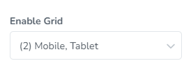
Enable Grid - Here, you will specify if the Grid view will be enabled for your Desktop, Mobile and Tablet.
Rentals page showing desktop without enable grid selected for that device size - rental cards will only be displayed in list view.

Show grid by default - This option allows you to set Grid view as the default for different devices - Desktop, Mobile and Tablet.

Grid set as Default for Desktop view as seen on the Rentals page.

With no device checkboxes selected, the setting will be displayed as seen below:

Max Columns - This setting lets you specify the maximum amount of columns that will show rentals in the grid view. The options are 2 and 3.

Max Columns set to 2 as seen on the Rentals page.

Grid Toggle Button - Here, you will be able to choose how the toggle button to switch to Grid view will be displayed. The options available are: Show icon and label, Show only icon and Show only label.

Show Icon and Label option as seen on the Rentals page.

Show only icon option as seen on the Rentals page.

Show only label option as seen on the Rentals page.

Availability Calendar
The Availability Calendar setting lets you choose whether you will like to show the calendar and if so, which area on the page to display it.
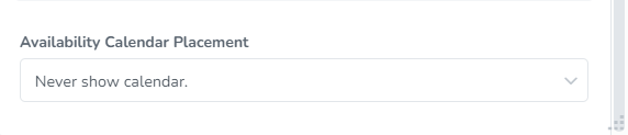
Availability Calendar Placement - The options available are:
Never show calendar - With this selection, the availability calendar will not be displayed.
Show calendar when no results - The availability calendar will be displayed if the search displays no results

Always show calendar at the top of each page - This option will display the availability calendar at the top of each page.

Always show calendar at the bottom of each page - This option will display the availability calendar at the bottom of each page.

Always show calendar at the bottom of last page - This option will display the availability calendar at the bottom of last page only, if your search results span multiple pages.